Design with a dash of spice.
The great thing about the graphic design elements inspired by Mexican art and culture is that they really are a nod to the richness of the country’s past and present traditions. There’s an almost whimsicalness on one hand with this type of design, and on the other, there’s a luxurious depth indicative of Mexican style. The vibrancy and fun inherent in Mexican design lends itself to a variety of branding elements, marketing material, packaging even. The versatility here is incredible; not to mention, the creativity when it comes to Mexican design is off the charts. Some of the most interesting representations of this aesthetic stretch what people think of when they are working within the context of graphic design.
Looking at examples of this type of style, you can instantly identify from where it comes. Mexican design is truly distinctive, make no mistake about it. And this again, is perhaps why it is so widely used when it comes to everything from fabric prints to restaurant-related design elements to food labels. Some say that design inspired by Mexico tends more toward a European flair versus an American one. And yet, we need only look at what is involved with Mexican graphic design to see that actually, it has a style and flair all its own!
Mexican Design: Some of the More Popular Trends
Besides its connection to a rich and colorful tradition and past, beyond the vividness and originality of Mexican inspired design, there are certain elements that have in the past several years really come to embody the spirit of this style. From the use of Mexican folk art standard fare to an emphasis on more natural features, the feel and aesthetic are making this particular design style tremendously popular right now. And the increased presence of Mexican graphic design doesn’t seem to be slowing down anytime soon. Below are a few of the key elements that have come to define what we understand as quintessentially Mexican as far as a design scheme goes.
The Use of Mexican Folk Art Images
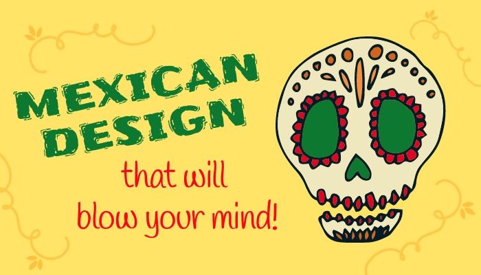
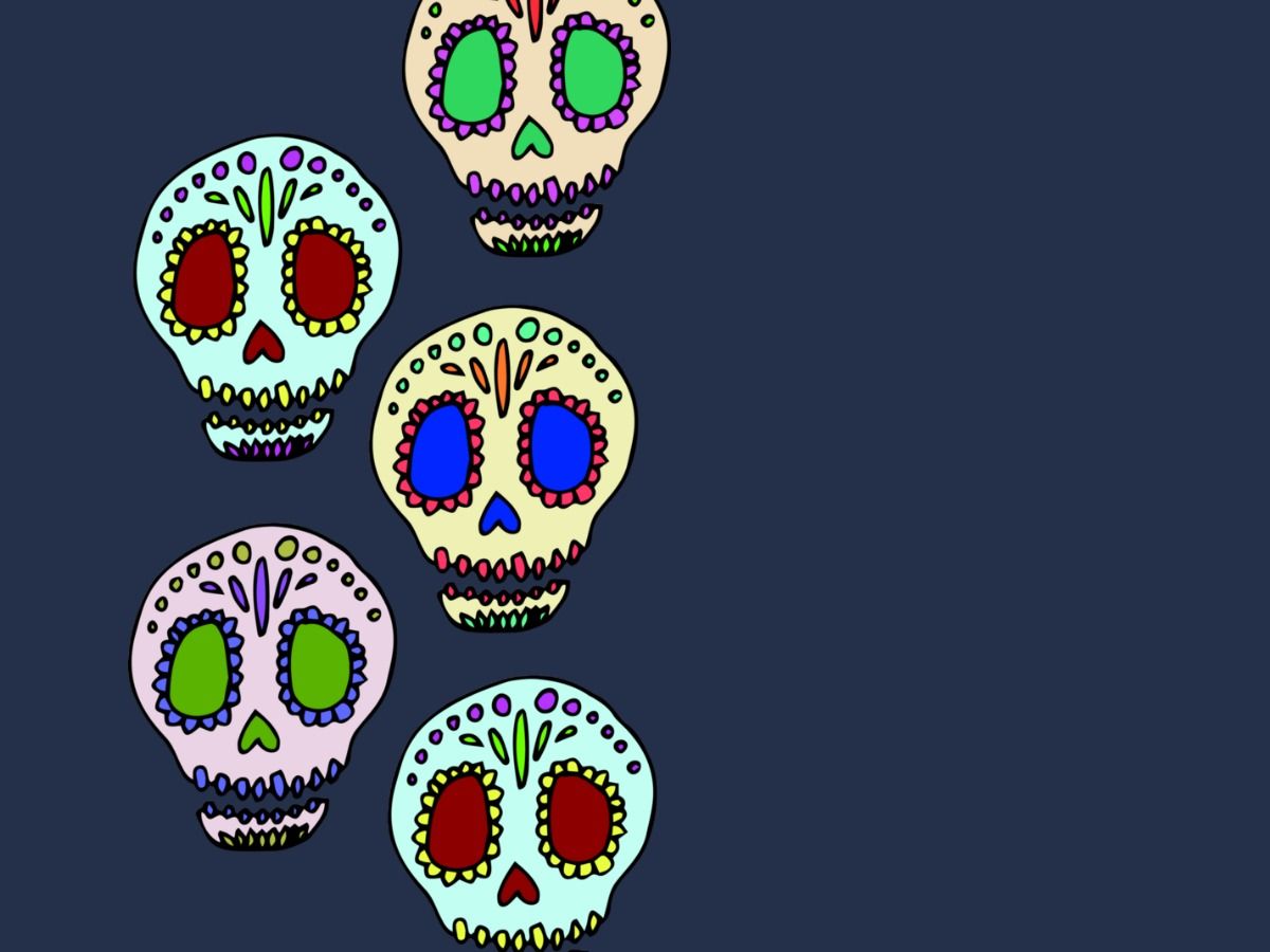
In Mexico, there is often great emphasis placed on images associated with the dead. Rather than mourning those who’ve passed, they embrace death; they celebrate those who have moved on. That said, the representations of death such as skulls for instance are widely used in this kind of graphic design. Yet their depiction is not necessarily an eerie or solemn one. In line with the celebration of the Day of the Dead, many skulls and skeletons (among other such emblems of death) are depicted in colorful and cheerful ways. With these types of elements, Mexican design really does find a way to have some fun with itself.
Additionally, another of the folk art/folklore inspired images you’re likely to encounter in some of these designs are matadors. Dating back to the 1500s, bullfighting represents more than just a sport that residents and tourists go to watch. In the context of the country’s culture, it symbolizes universal struggle. And this is why, we do see numerous representations of bullfighting in Mexican graphic art. Because of how consequentially it is viewed in the larger scheme of things.
They truly do use heritage to inspire design. Mexican graphics take on a deeper meaning precisely because they are about more than just creating for the sake of having a “pretty” design. It is about connecting that design with a cultural past, a rich present, and a beautiful understanding of what Mexico is all about.
Animal Art in Mexican Graphic Design
Beyond the use of folklore imagery, we do see quite a lot of animals used in this form of design. Animals in most parts of the country have a deep spiritual significance aside from their physical, more practical one. For example with the donkey, in light of how hard it works and how smart the animal is credited as being, the people of Mexico actually have full-on celebrations of this particular animal. It has come to be a symbol of peace and utter devotion. This is why we see many iterations of donkey themed Mexican design. And of course, they again aren’t afraid to have some fun with it. The anthropomorphized donkey is generally cute, relatable and often quite whimsical.
The rabbit is also an animal that seems to frequent Mexican graphic design. Rabbits actually date back to Aztec culture and held great significance therein. Today, because the history associated with rabbits is so strong, the animal is often spotlighted in elements of design. And as with the donkey, the resulting images are usually vibrant and fun.
Some other animals you’re apt to see in Mexican design: roosters, jaguars and a wide variety of brightly colored birds. Most often, this type of design will lean toward the animals that are endemic to the country and thus more easily recognizable from a marketing standpoint.
Floral Elements of Mexican Design
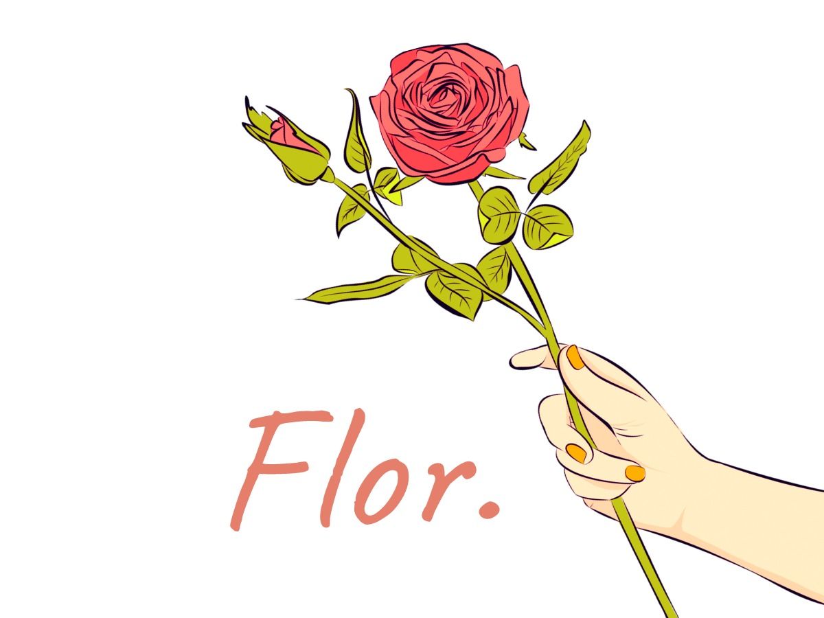
Flowers—everything from orchids to Mexican sunflowers—are very common elements when it comes to the graphic design style associated with the country. Flowers are key in festivals and celebrations. Again, during the Day of the Dead, flowers play a major role as they line doorways and arches. Marigolds especially are quite popularly used during the celebration. So, it is therefore easy to see why floral design is so prevalent. Plus, flowers do of course lend themselves to the kind of bright and colorful palette that much of Mexican design centers on.
They definitely have fun with flowers as you can tell by looking at some of the floral inspired design that’s out there. As with the use of animals, flowers—beyond their physical beauty—also hold deeper meaning as well in the country, especially certain flowers. As mentioned, the marigold for instance, has important significance and is thought to be the purest offering one can make to Mexican deities.
Because of location/climate, Mexico has quite an abundance of flowers. Besides the ever popular marigold, one of the more prominent flowers that you will see in Mexican design is the dahlia. It’s actually the national flower.
The Importance of Using Bright and Vibrant Colors
Pretty much when anyone thinks of graphic design representative of Mexico, they are immediately going to think big, bold colors. And they certainly would not be wrong. Given any of the elements we’ve covered so far, color is always at play. It is an essential part of this design style and it is what ultimately makes it pop in such an incredible way.
Many such designers are also not averse to colors clashing. If done well, colors that may at first glance seem discordant really do come together to create an effect that speaks to the heart of what Mexican influenced design is about. The culture here is one very much grounded in the idea of freedom, of living for the moment, of taking chances. You can’t really convey this through muted tones or colors that blend into the background in a manner of speaking. And so what we very often see are risk taking moments when it comes to the color combinations utilized in this specific style.
The colors of the Mexican flag are hugely popular. When it comes to designing with bright and bold colors, perhaps there are none more so bold than those of the country’s flag. This is why red, green and white do tend to crop up fairly frequent. They are most definitely eye catching, that’s for certain!
Hand Drawn and Sketched Designs
Hand in hand with the nod to their folk art past, we also get a lot of designs that appear to be hand drawn and / or somehow otherwise sketched. Some say hand drawn elements lend a more personal touch to marketing materials, posters, brochures, what have you. So for instance, when companies take this particular design approach, they are in fact making themselves more relatable. Others suggest that Mexican graphic design uses so many hand sketched elements because they want to gesture toward a simpler, more rustic past.
With this style, it really is all about tradition meeting a more casual vibe in some senses. This is precisely what that more textured hand drawn look accomplishes. It also lends itself to an organic aesthetic that very much gets to the heart of what Mexico-inspired design schemes are all about.
Simpler sketched looks stand out. Without question, when done properly, when there’s attention to detail even given simple elements, the results are stunning. And in turn, the design becomes a true standout.
Creative Typefaces are Used in Mexican Graphic Arts
They’re definitely not afraid to play around with typesetting and font styles. In many cases, the bolder the better. Also, as with the more sketched style we discussed, the typefaces used do tend to have a more organic feel and flow to them. The coming together of the traditional as seen in ancient Mayan writing forms for example with more modern spins has resulted in some uniquely vibrant fonts and typography.
Again, with the lettering style it is about standing out and at the same time expressing personality. Mexican design has nothing if not a ton of personality. Even when considering the style font/typesetting, the design itself speaks to the fact that no detail has gone overlooked. In fact, in many such design examples, the wording is front and center because it does flow so organically; it manages to really shine a fierce light on whatever idea/product/promotion is being offered.
Typeface shouldn’t be an afterthought. If we take anything away from inspirational Mexican designs it is that everything counts: color, texture and yes the style of the letters used.
The More Intricate the Design, The Better
Mexican art in general does nothing halfway. Highly detailed and intricate design is a staple of what we find when it comes to this particular style. Lines intertwining, florals overlapping, the intersections of a variety of elements ornately done—this is a hallmark of this kind of graphic design. Here again, when talking intricate and ornate, the use of skulls certainly can also fall into this category. Skulls because of their association with the Day of the Dead are frequently found throughout all sorts of designs of this nature. And very often, they will be decorated with highly detailed patterns, splashed in an array of colors and thus transformed into amazing works of art.
If you look at traditional Mexican tile even, we see complex patterns play out. In some ways, graphic design really does takes it cue from such tile art. Beyond tiles of course, there’s the rich intricacy of Mexican embroidery, also reflected in numerous graphic art motifs. You see beautiful patterns practically wherever you look, inspired by this vibrant and exciting North American country.
Mexican flag colors also play into intricate patterns. The red, green and white really do pop up quite a lot in this style. Not only are these colors relevant as far as a national standpoint, but they blend well together in many of the Mexican-inspired designs you will find.
Artistic Influence in Mexican Graphic Design
Mexico has quite an impressive track record as far as producing some world class artists—some of the most famous artists ever to live for that matter. The likes of Frida Kahlo and Diego Rivera among the most notable. So it’s no wonder that a lot of Mexican generated design does in fact utilize influences from the world of fine art. And why shouldn’t it…Art after all is what gave rise to the graphic arts in a big picture kind of way.
In one such nod to their esteemed lineage of painters and artists, you will often see a lot of natural imagery. Blending this with contemporary flavor, the results are simply amazing. It really is taking graphic design to whole new levels in a way.
Frida Kahlo is perhaps the most iconic Mexican artist. To this end, you will find that a lot of Mexican inspired design does gesture toward her penchant for blending nature with more surrealist themes. She also was drawn in by Mexican folk ideas and art, as is reflected in her work.
The world of Mexican design has recently come to the forefront as far as what’s trending and what incidentally plays well in terms of catching the public eye. Because it is so intricate at times, simple at others, original and whimsical there is a ton of room for interpretation, which means there is also a ton of ways in which this style of design can be used. We are seeing more and more companies worldwide turn to the folk-centered approach that in many ways grew up in Mexico.
Mexican style – your way.
In some sense, you could say there is an authenticity inherent to this aesthetic that many are looking for now. Especially given what the world is experiencing, there is something distinctly reassuring about the design ideas influenced by Mexican culture. This is a very real and honest design approach that isn’t afraid to have fun with itself. At the same time offers an integrity that perhaps you might not get with some of the other graphic art styles.
It is no wonder why many are starting to stand up and take notice when it comes to Mexican design. There truly is something for everyone. And the fact that even a simple Mexican inspired logo can tell a story that spans a country’s history is pretty amazing. You’d be hard pressed to be able to do this with any other style of graphic design, that’s for sure.

anne carson
Anne is a former English professor turned content writer. Holding a PhD in Literature, she spent almost a decade in academia putting that degree to use, until finally realizing it wasn't exactly the best fit. A full-time writer, she's learned a great deal about the numerous subjects. She knows a lot about design trends and design templates. A mom of five (two teenagers and three dogs).
