Explore our font pairings and find out about best practices that you can apply to your designs. Get inspired to experiment with various combinations and discover pairings that work well for your projects.
Finding two complementary fonts that can be your go-to fonts for heading and body copy for branded designs can be tricky. When it comes to branding a strategically chosen pairing helps you with consistency and ensures visual hierarchy and readability.
Use font pairings to create a visual hierarchy where the heading is more prominent than the body copy. This way, headlines initially attract your audience and the complementary font style of the text leads them to read on.
Here are fifteen font pairings you can find in Design Wizard:
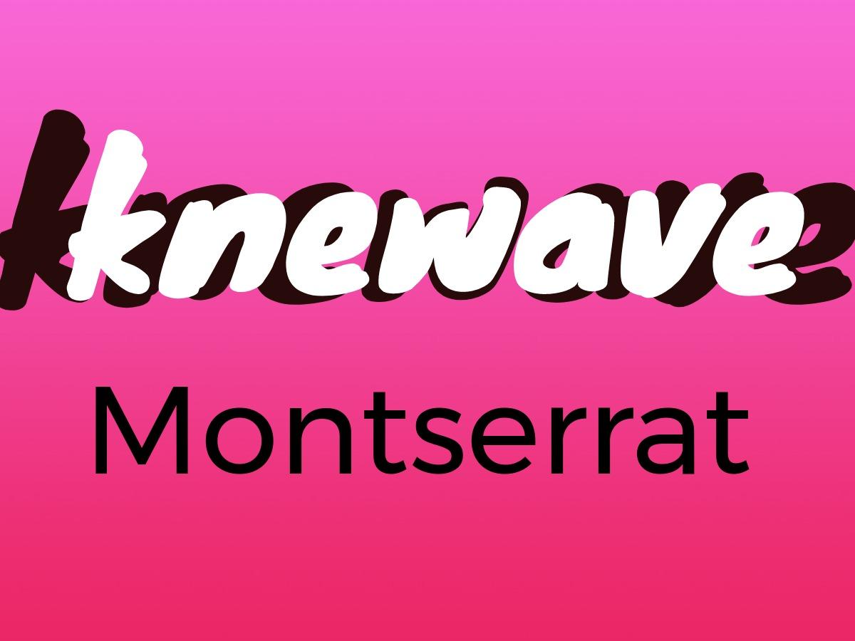
Knewave and Montserrat
With its slanted italic effects, Knewave creates visually engaging movement. Montserrat is part of the sans serif font type that is easily legible and conveys simplicity.
Combine the big bold display font of Knewave with the straightforward Montserrat sans serif to create an eye-catching effect. Knewave attracts attention while Montserrat is suitable for the parts of your design that focus on conveying more information.
The movement inherent in Knewave makes it a style fit for experimentation with color. Try various combinations to work with other colors in your design until you’re happy with the result.
Create Contrast and Balance with Font Pairings
In Design Wizard, select colors with the color picker tool or enter hex values if you know what you’re going for. Combine the color of Knewave with the simpler Montserrat style in your body text to add a calming balance to the movement.
The contrasting nature of this combination is what makes it work. The goal for an effective design is to find totally different but still complementary typefaces to create contrast that catches the eyes of viewers.
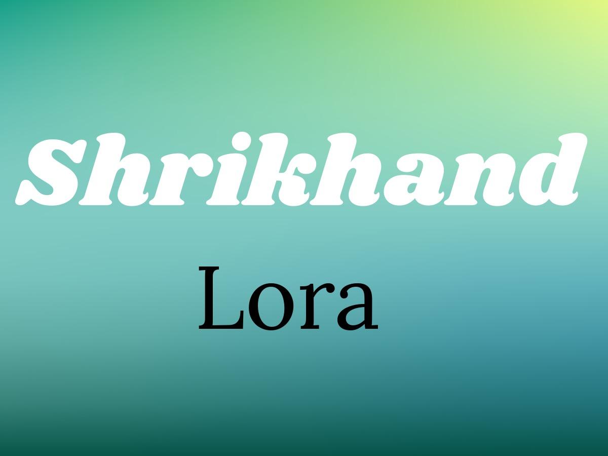
Shrikhand and Lora
Shrikhand was created to be as free and as expansive as possible and it shows in its big, bold, and unapologetic style. A contemporary serif with roots in calligraphy, Lora is a well-balanced typeface that creates a moderate contrast when used in body text.
Paragraphs laid out in Lora stand out through the contradiction of brushed curves with driving serifs. Use this font style to create associations with a modern-day story or an art essay. Pair this with the boldness of Shrikhand and you get an attractive contrast suitable for a social media post.
Set the Tone with Typographic Color
Font weight, size, stroke width, leading, and kerning are some of the factors that combine to create typographic color. This is about seeing the overall tonal value of the fonts in your design.
You can test this by squinting at your text until you can’t read it anymore but still see the visual hierarchy that you’ve created. In our design, the main contrast is created by the use of the classic color combination of black and white.
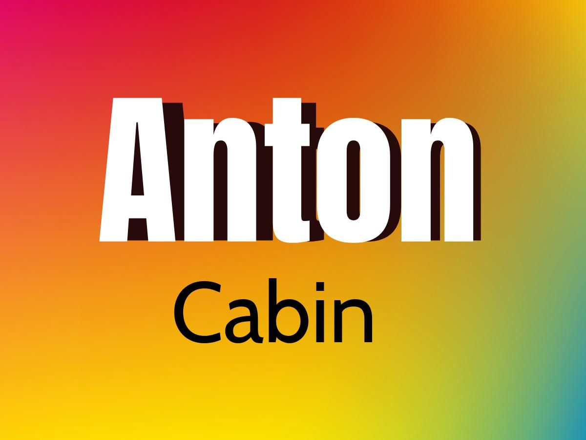
Anton and Cabin
Anton goes back to a traditional sans serif typeface that was updated for its use as a web font. Cabin is a mix of humanist and geometric sans style with modern proportions.
Make Anton large in your web design and experiment with layers to play with levels of emphasis. You can find the Cabin font in Design Wizard in regular, bold, and italic. Try Cabin in bold if you don’t want Anton to overpower the thinner Cabin style too much.
Implement Visual Hierarchy With Font Pairs
To create a clear visual hierarchy with the typefaces of your choice, explore the differences when you change font weights and sizes. In this font pair, you can see a natural contrast between the heavy Anton style and the light Cabin font that adds personality to your design. Experiment with layers to see how you can create an even more striking and bold appearance.
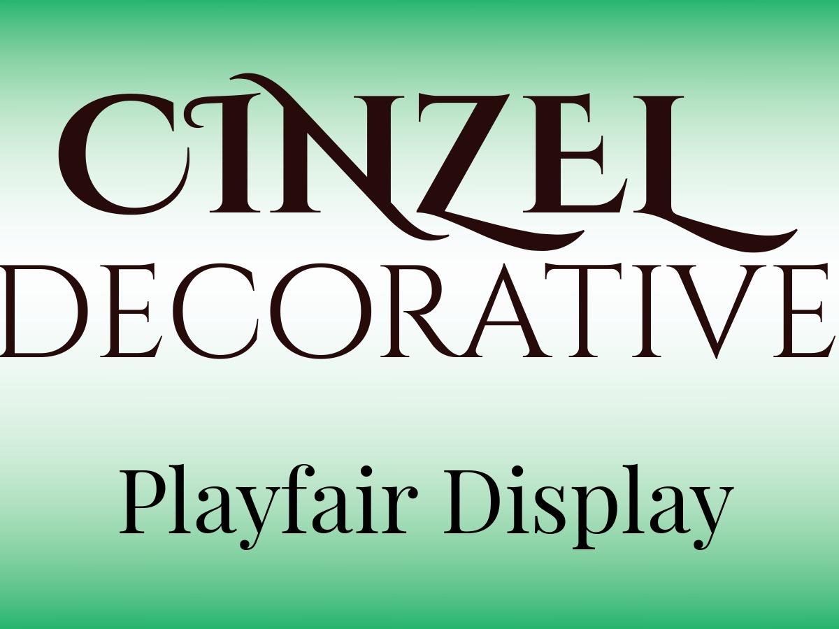
Cinzel Decorative and Playfair Display
Cinzel Decorative evolved out of first-century Roman inscriptions and is based on classical proportions. While conveying ancient history, it also has a contemporary feel to it.
Playfair Display represents the transition from handwritten to print with the change from quills to pointed steel pens to new developments in the printing industry. The result is a high-contrast letterform with delicate lines.
Make use of the unique look of Cinzel Decorative to make your design pop. In combination with the serif style font Playfair Display for headlines, taglines, or slogans, you can achieve a modern look. Play around with the boldness of Cinzel Decorative to create contrast and see how that affects your design.
Prioritize Fonts to Establish Visual Hierarchy
To create a visual hierarchy, decide which parts of your design are more important than others. Your choice of font should reflect your priorities first. Following that, you can experiment with font weights and sizes to play with emphasis and fine-tune your typeface design
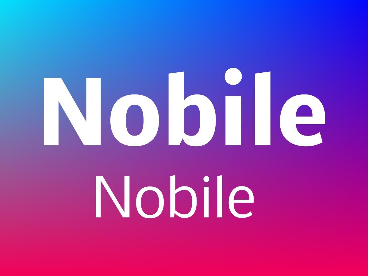
Nobile and Nobile
Nobile is a sans serif typeface that works well on digital screens. Although you find this font mostly on devices, it still retains the distinctive look of a style commonly used in print.
Nobile prioritizes functionality and legibility and looks good on both large and small displays. In this case, we paired the highly practical Nobile with itself. Find the regular, bold, and italic versions in Design Wizard and experiment with the different styles of Nobile to create attractive designs.
Try Pairings within the Same Font Family
A simple way to create contrast is to pair a font with itself in its different styles like bold, italic, or condensed. Try this by playing around with one font first to see if you even need a different complementary typeface for your design.
Experiment with weight and size before you add any other fonts. You can also look for pairings within a font family to save you the time you’d spend on researching a style that works well with your first chosen font.
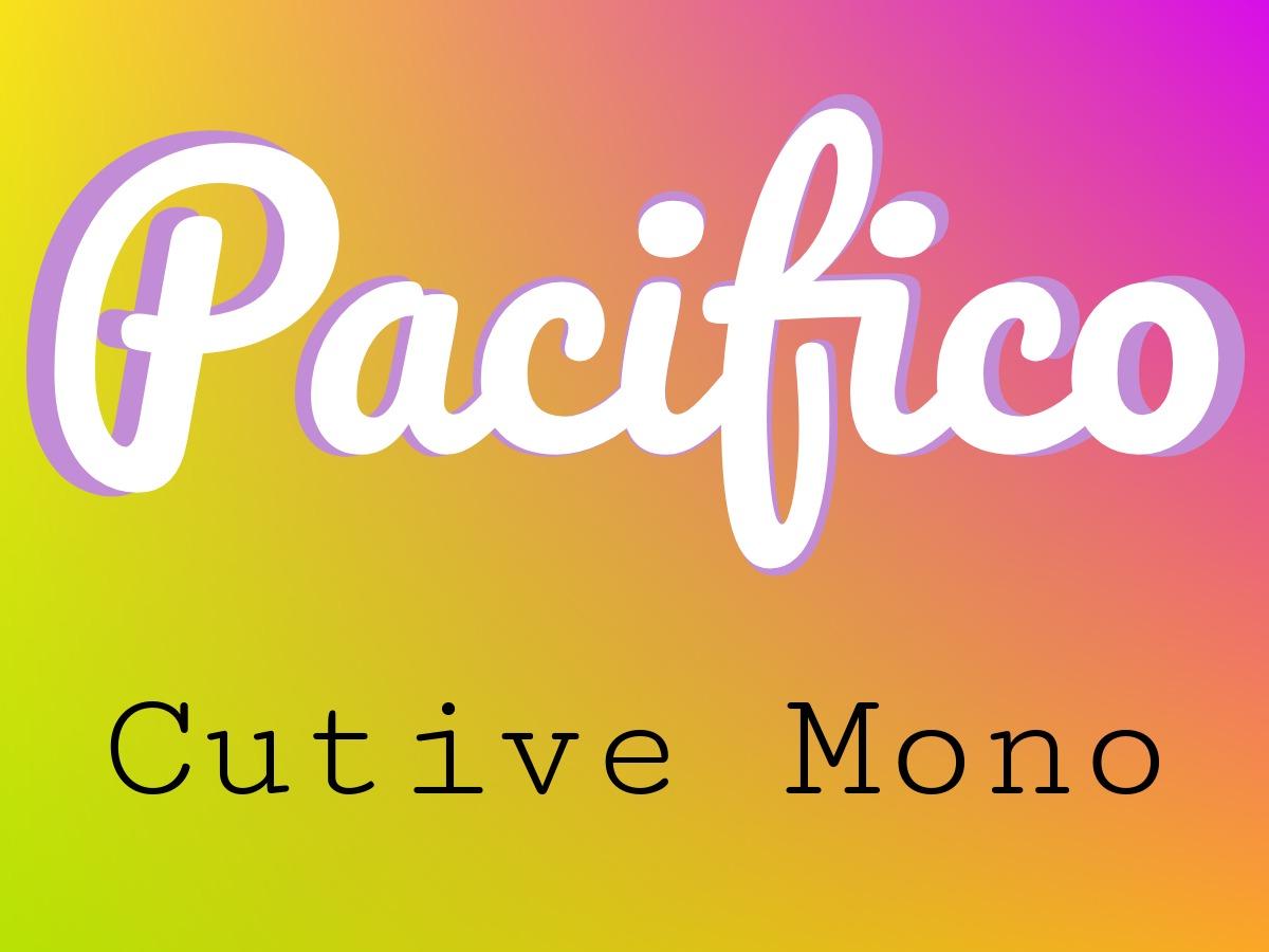
Pacifico and Cutive Mono
Pacifico is an airy script font that conveys a joyful spirit and works well in modern informal designs. Both the Cutive typeface and its sister family Cutive Mono are based on a classic typewriters style.
Experiment with colors that make the Pacifico font pop and adjust sizing to create an engaging effect and elevate your design. Combine this with Cutive Mono in toned-down colors or black to add character to your body text designs.
Play with Font Size and Weight
Explore how your design changes when you make one simple adjustment like changing the font size. Some styles are unintelligible when sized down too much while others look better when used for smaller text.
In our design, Pacifico is too bold and condensed for longer stretches of copy and works better in larger sizes for headings while Cutive Mono is evenly spaced to be easily legible even in smaller sizes. Play with font sizes and weights as well as line spacing and letter spacing in Design Wizard to see what works best for your design.
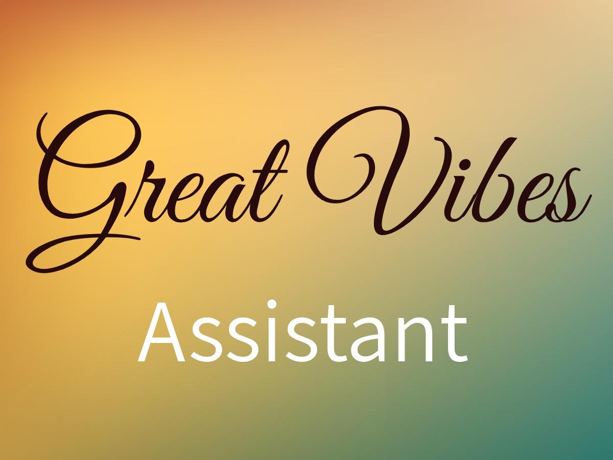
Great Vibes and Assistant
If you’re looking for a beautifully flowing script typeface, explore the ascenders and descenders of Great Vibes. Like all script fonts, it resembles a handwritten or calligraphic style that can be either elegant or playful depending on the connection between letters. Assistant is one of many straightforward sans serif fonts that work well for body texts.
The classical look and beautiful loops of Great Vibes work well on invitations, cards, or sign-offs. Decide on one color for the most important information you show in type and combine it with the neutrality of Assistant to create your minimalist design.
Craft Distinctive Font Pairs
Combine script fonts like Great Vibes with a sans serif like Assistant to create a distinctive contrast in your design. Use script fonts in larger sizes to make them easier to read and put even more emphasis on that part of your design. Use colors that go togetherto explore interesting effects that catch your audience’s attention.
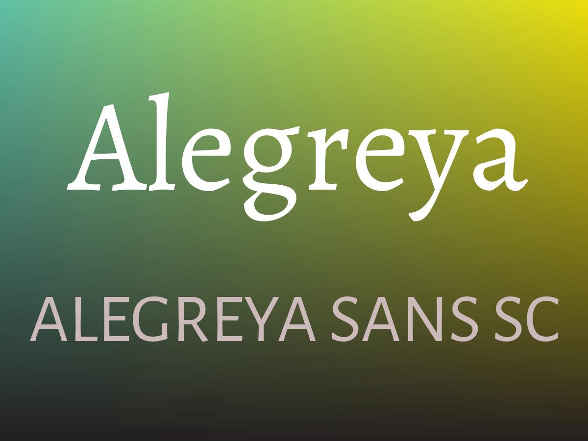
Alegreya and Alegreya Sans SC
The Alegreya font family provides freshness while harking back to calligraphy. Originally intended for literature, Alegreya has a dynamic and varied rhythm that is particularly suited for long texts. Depending on the individual style, you get a more contemporary or more traditional look.
Alegreya Sans SC is a small caps version that connects a humanist sans serif family with the calligraphic elements of Alegreya. Combine both styles from the same family to get a pleasant design that is easily legible.
Use Popular Font Combinations
Even though this font pairing comes from the same font family, a contrast is created by the difference in style between a serif and a sans serif font. This is a popular type of combination where serif serif fonts with lines attached to the end of strokes work well with sans serif typefaces that have no embellishments.
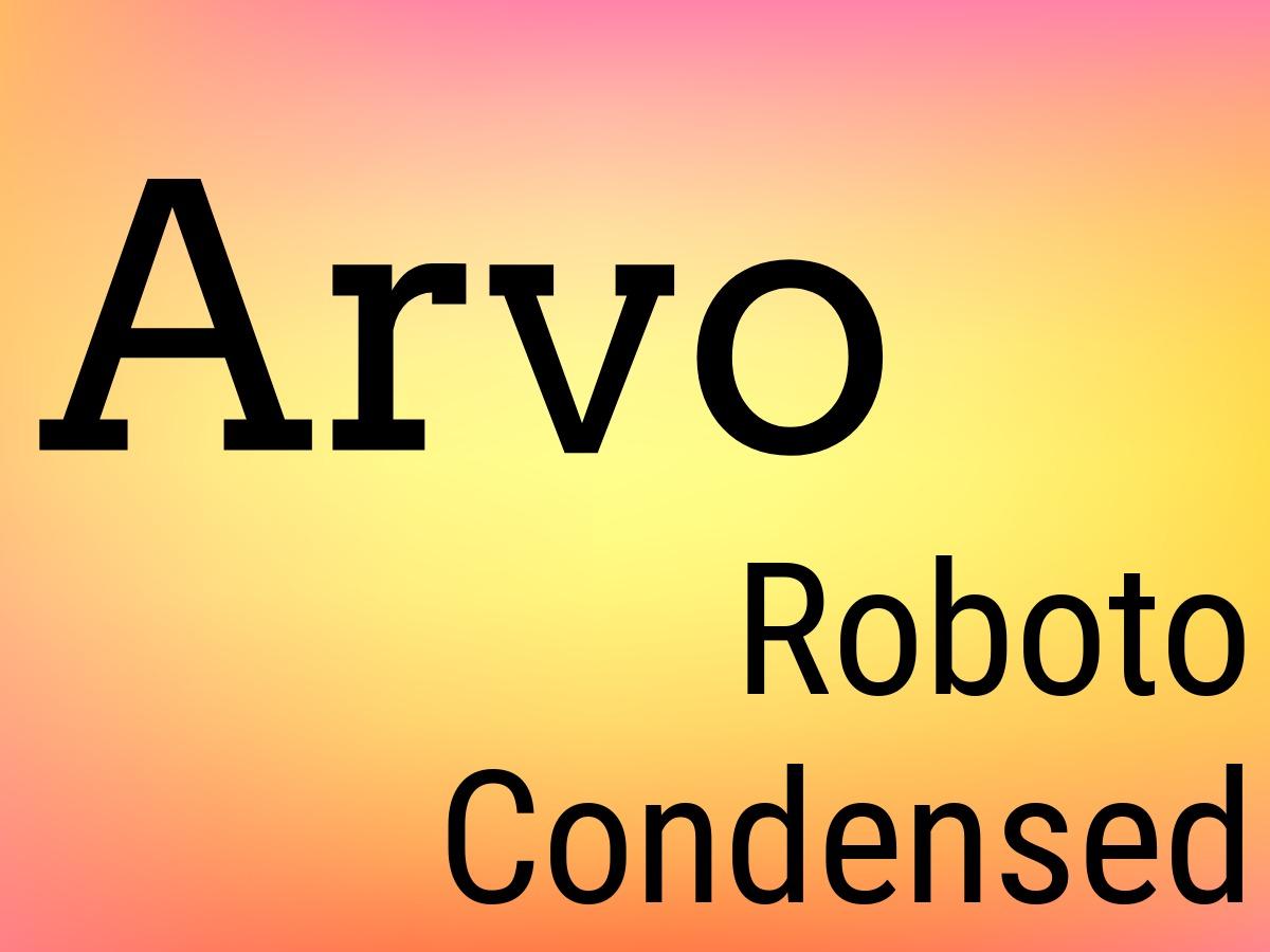
Arvo and Roboto Condensed
The geometric slab serif font Arvo is versatile. It’s a typeface that you can use for both digital and print media. With the letterforms placed at a natural width, Roboto Condensed is an attractive and highly legible typeface.
Get your design noticed with the more blocky and bold letters of the Arvo typeface. The bold option is available in Design Wizard and is perfect for headlines. To get a balanced design, use Roboto Condensed for your main content.
Test Your Pairings
Make sure you don’t pair fonts that are too similar. A lack of differences between styles makes it tricky to establish a visual hierarchy. An easy way to test whether the fonts you’ve chosen for your design are distinctive enough is to have a side-by-side comparison.
Sit back and squint at your screen. If the two fonts you placed next to each other look the same, your search for a contrasting font isn’t over yet.
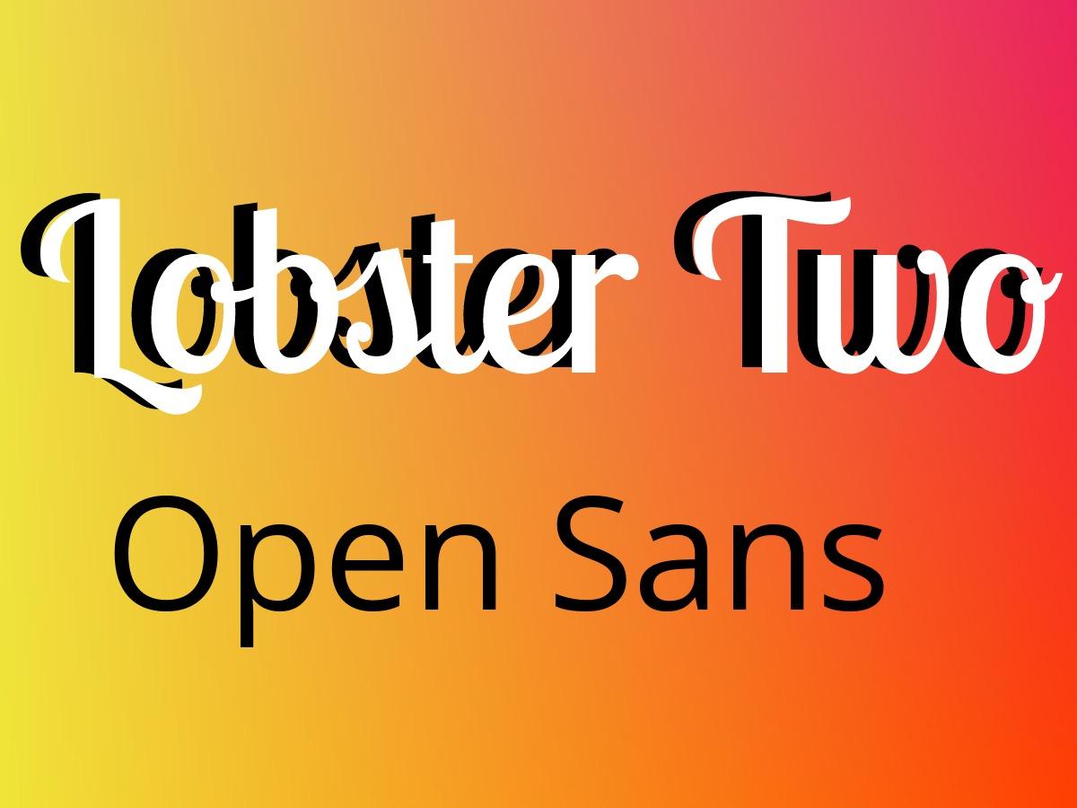
Lobster Two and Open Sans
The OpenType format of the Lobster typeface means that these styles are scalable and offer support for international characters. Lobster Two is an attractive bold but condensed script font. Open Sans is a humanist sans serif typeface with a clean and open style that makes it easy to read particularly on screens.
In this font pairing, use Lobster Two to create a playful and eye-catching headline while Open Sans is a great option for longer passages of text. The contrast between the two fonts attracts attention and is easily legible from a distance.
Evoke Emotions with Fonts
Script and handwritten fonts are versatile and popular with designers. They have strong personalities and easily evoke emotions, which means that you have to be careful to not overwhelm your audience with these kinds of typefaces.
In our design, we paired the potentially overpowering personality of a script font like Lobster Two with the balanced look of a sans serif like Open Sans.
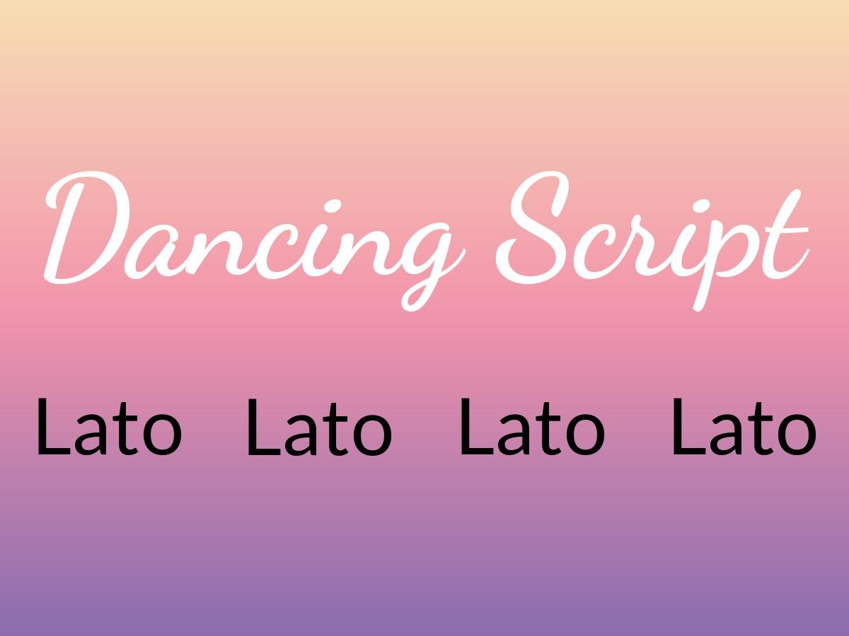
Dancing Script and Lato
Dancing Script is a lively and casual script typeface where letters bounce and change size slightly. Caps are big and go below the baseline. Lato is a warm yet stable sans serif font. It’s easily scalable as there’s no unnecessary overlap between letters.
When these two fonts are paired in a design, the semi-rounded details of the letters give Lato a strong structure that provides stability for the elegance of Dancing Script. Use Dancing Script to convey a friendly and informal atmosphere in your headings.
Experiment with colors in Design Wizard to find what matches your occasion. This draws your audience in to read more information in the more serious Lato font style.
Pick Your Main Font
When you get started, ensure that you picked a main font that reflects the personality of your business or the key message of your project. Use this main font as your starting point to choose a second one.
Test various combinations by putting the two styles next to each other and looking at the differences to see if they complement each other. Our design is a great example of a script and sans serif font working well together.
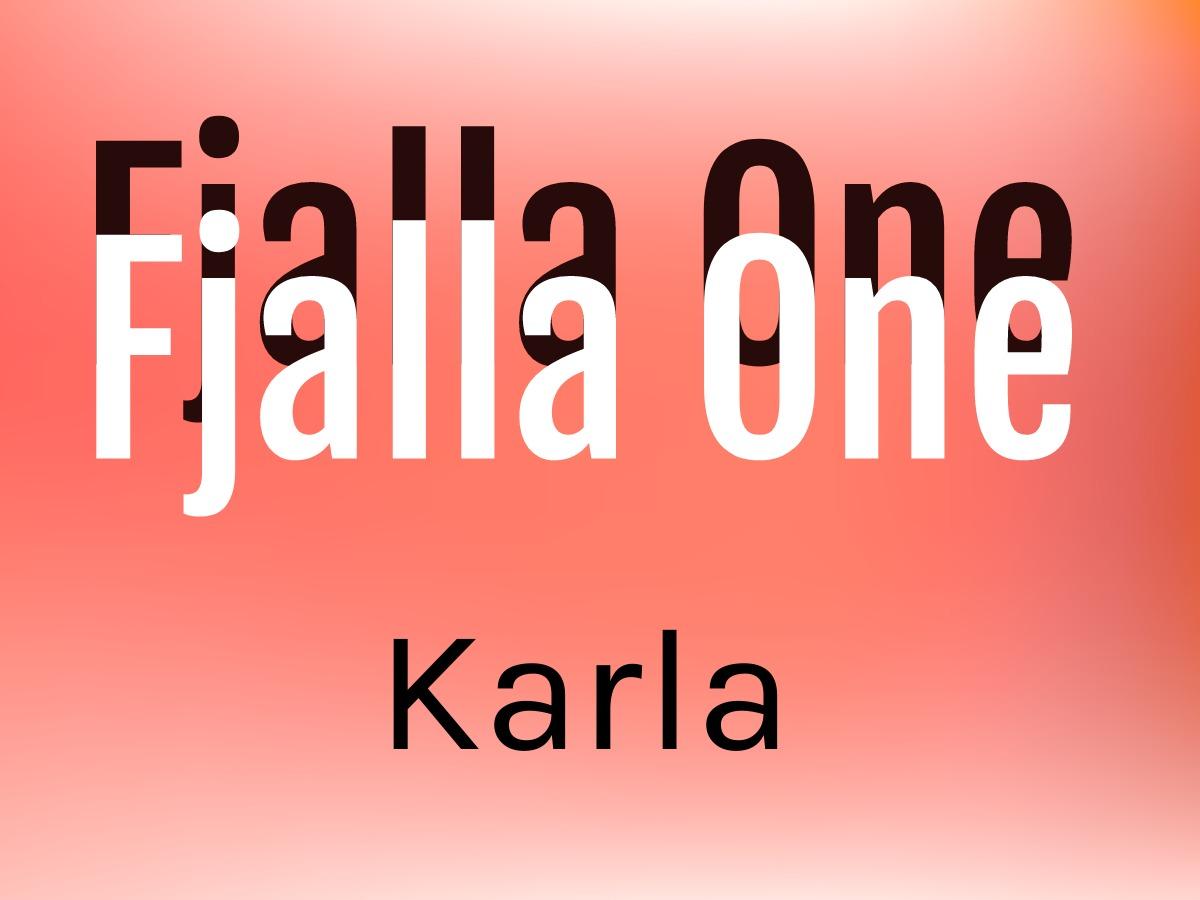
Fjalla One and Karla
Fjalla One is a display sans serif font. Its bold look makes it a perfect match for any colorful headline. Karla is a sans serif font style that is calm and easy on the eyes without the embellishments of a serif font.
The eye-catching display font Fjalla One with its shadow effect is best paired with the more neutral Karla style. Create a balanced design with this classic font pairing that pulls the reader in with just the right hint of interest.
Keep Your Design Simple and Legible
Keep your design simple and easily legible by choosing two fonts or a maximum of three fonts only. Font pairings of only two complementary styles work best if you want to make sure you don’t overwhelm your audience.
We applied this principle to our design for a consistent and professional look. To find the two font styles that fit your design, explore our Design Wizard font library and experiment with a vast selection of typefaces.
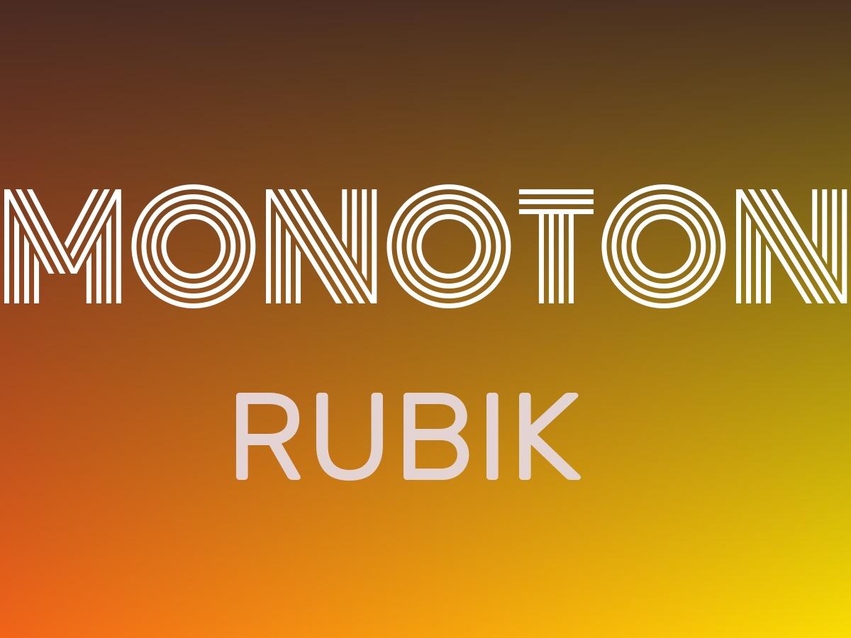
Monoton and Rubik
Monoton is an attractive retro font that’s best legible in larger font sizes above thirty points. With its rounded corners, Rubik is extremely versatile and easy to read across longer passages of text.
The sense of glow and radiance that Monoton exerts works well for headlines in retro and neon designs. It conveys luxury and exclusiveness and is best paired with a sans serif like Rubik. In this font pairing, Monoton stands out with its big bold letters, which requires the balance of a calmer font like Rubik.
Pair Display Fonts with a Serif and Sans Serif Font
The strong personalities of novelty and display fonts are best paired with a sans serif or simple serif typeface. The key is to find the right balance between the contrasting styles. When you’re using a display font like Monoton, make sure you increase the size for better legibility. Apply simplistic colors to avoid creating an overpowering headline.
We chose white for the headline in our design and an off-white color for the Rubik font style, which connects the two while still retaining the visual hierarchy of a clear heading and body text.
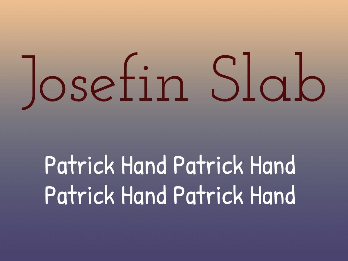
Josefin Slab and Patrick Hand
Josefin Slab is a distinctive typewriter-style slab serif font, which is ideal for headings. Patrick Hand is a neatly handwritten font with personality and a friendly vibe.
Slab serifs are slimmer and more modern than serif fonts while still retaining the classic qualities and readability of serifs. Rather than italicizing or bolding words, use a slab serif like Josefin Slab to point out important information. Pair it with the sympathetic handwriting style of Patrick Hand to give your design character.
Choose Your Fonts According to Purpose
Make your choice of fonts for your projects according to the purpose, theme, or medium of your designs. Different types of media like print or online have different requirements for fonts. The main focus here is on legibility as some fonts might be easier or harder to read on-screen compared to what you get on paper. For example, script fonts are well suited for a headline on an invitation card but don’t work as well for headings on a website.
Whatever font pairing you choose, make sure you stay consistent within a project or use typefaces that align with the rest of your brand guidelines. Browse our Design Wizard library to experiment with different styles and find the font that works best for your design project.
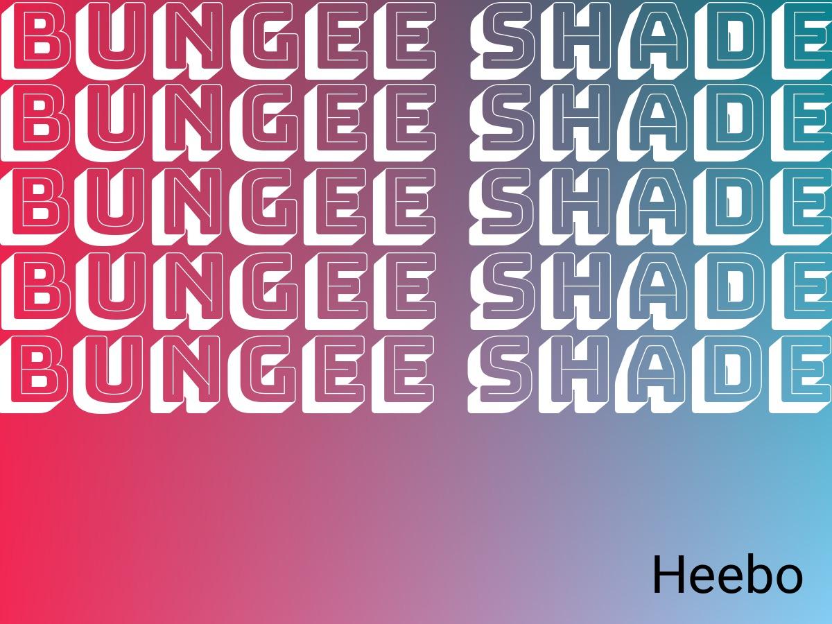
Bungee Shade and Heebo
Bungee Shade is a typeface that celebrates urban signage. It can be an eye-catching feature in your design in both the horizontal and vertical orientation. Heebo is a sans serif font with a crisp, simple, and modern style.
As a display font, Bungee Shade works best in designs when layered with itself in variations of color. It conveys a powerful sense of urbanism and a retro style that pairs well with the uniform Heebo font. In Design Wizard, you can also find Bungee Inline to experiment with your designs.
Create Balance within What You Designed
It’s best practice to pair a distinct font like Bungee Shade with a neutral type like Heebo. If one of your chosen fonts exudes a powerful personality, make sure you’re using a font that doesn’t compete with that. The aim is to create balance within what you’ve designed that draws your readers in. Within that, you can experiment with different layers, font sizes, and weights.
In our design, we explored layers and placed the same text on top of each other. You’re not confined to one area with your typeface and can move layers around the canvas in Design Wizard. Use the grid option to make sure your layers are in line with the rest of your design. Also you can use special font editor tools to make your fonts even better.

Elisabeth Strasser
Having graduated with a Professional Writing MA with distinction, Lizzie set out to gain her copywriting and digital marketing experience in Cork City.
An Austrian with a love for Ireland, Lizzie loves exploring Irish folklore and storytelling. Her favourite DW tools are: Youtube Outro Maker and Add Logo to Video tools.
