Elements of design are the parts of your work of art that you arrange and craft to create visually pleasing designs. It’s important to be aware of how these basic principles work together to find your way towards stunning designs more easily.
Use elements of design principles to guide you and to understand how design works but don’t see them as a strict set of rules. Good design still requires creativity, which means that rules can be bent or broken.
Even if you’re not a graphic designer, it’s important to have a good grasp of these principles. Whether you’re creating display ads, a logo for your business, or a sales brochure, create engaging and more impactful graphics that draw customers in by using elements of design.
1. Line
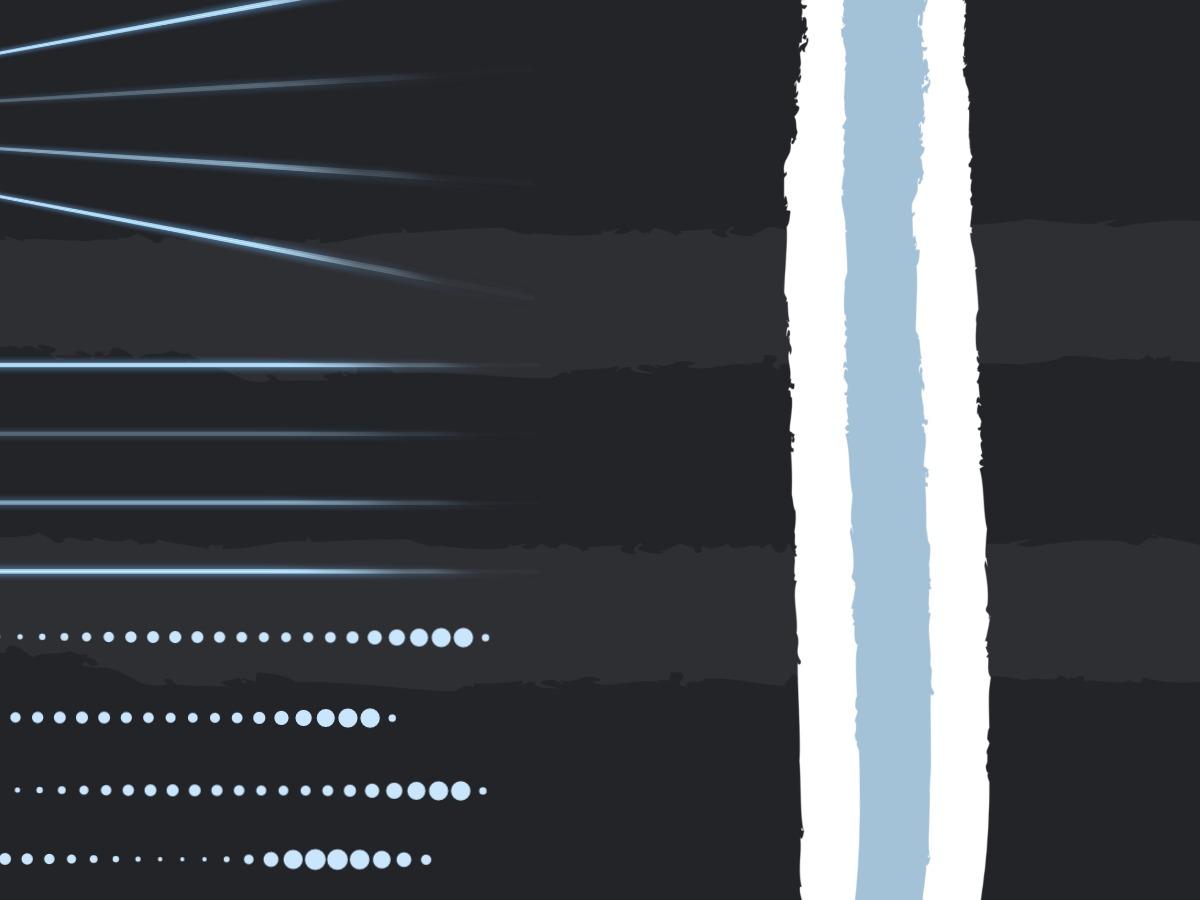
The line is the most basic element of design. Drawing a line with your pencil is how you get started with a painting or sketch and in graphic design any points that are connected form a line. This is also called an actual line while the edge between two shapes forms an implied line.
Lines can vary in thickness, be smooth, rough, continuous, or broken. They can have different directions such as vertical, horizontal, diagonal, curved, or move up and down across a page in a zigzag pattern.
Use Elements of Design to Pick a Focus
You can use lines to offset parts of your design and draw the eye to a particular area or focal point. In advertising, guide the audience to the main object or product you want to sell. Emphasize design elements with bold lines and use thin lines for decoration. If you want to establish a more personal connection, appeal to your target market with lines that mimic handwriting.
2. Color
Color immediately stands out in any design. Depending on the type or shade, you can use colors to emphasize elements or evoke certain feelings. Choosing the right colors is crucial when you’re trying to tell a story with your design.
Make sure you know the fundamentals of color theory to choose colors that complement each other. Look at different hues, saturation, and brightness before you make a selection. Consider which color space you need to work in and what the best practices are for print or screen use.
Color as a Vehicle for Emotions
The emotions colors can evoke are an incredible tool for advertising. Make sure the colors you pick for your ad design conjure up the feelings in your audience that you want them to associate with the product. Find different appealing color combinations that help you to get your message across to your customers. Use a color scheme for your website that evokes emotions that fit with your overall brand message.
3. Shape
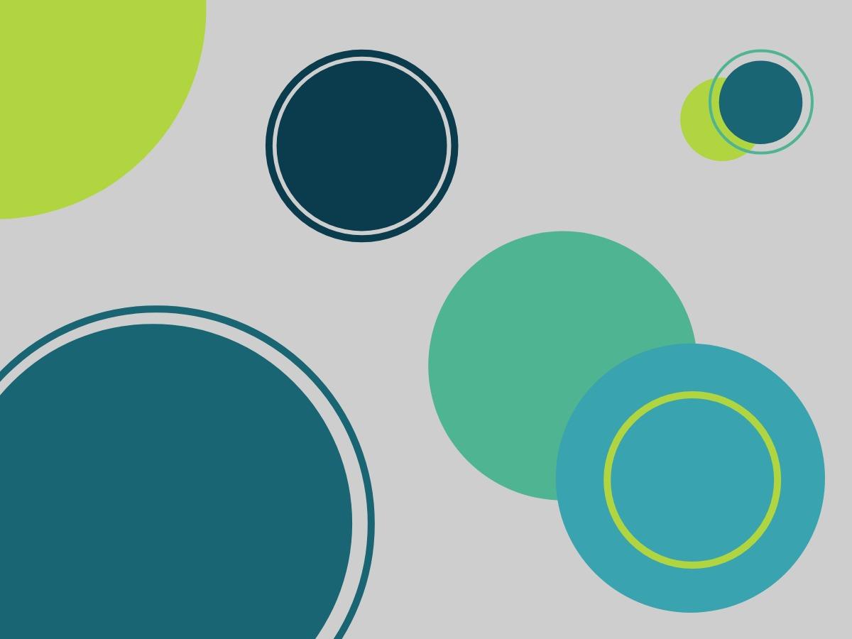
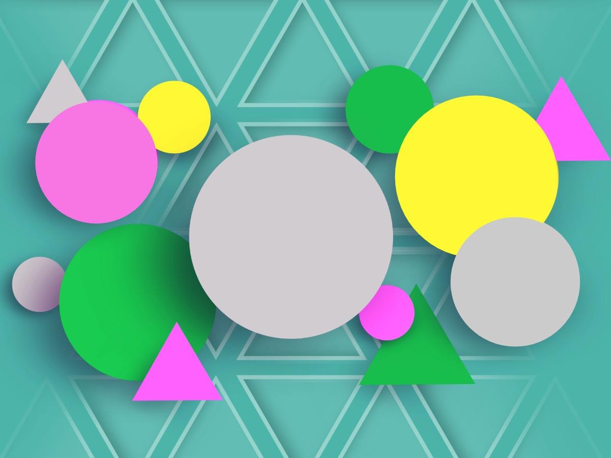
A shape is any space that is enclosed by lines. There are geometric shapes like a square, an oval, and a triangle, or organic shapes like speech bubbles, a blob, or any irregular free-form shapes.
Just like colors, different shapes conjure up different feelings. More rounded shapes create natural and calm emotions while sharp edges grab attention. Squares convey rigidness, triangles energy, and circles fluidity. Use shapes to create patterns, textures, or symbols depending on the relationship you construct between them.
Attract Attention with Shapes
For logo designs, create dynamic visuals with layered patterns or use shapes as stand-alone visual elements. For call-to-action buttons on your website, experiment with various shapes combined with different colors that stand out. See which combination works best.
4. Space
When you look at space within your design, you’re viewing all the areas within, around, above, or below the objects you placed on your canvas. Space can both connect and separate elements. Establish narrow spaces between elements to create a connection and wider spaces to convey separation. Both ways generate a design flow.
Space can be positive or negative. Negative space is also called white space, which helps to group and organize elements. Use white space wisely to create a layout that doesn’t overwhelm viewers and gives their eyes places to rest.
Establish Structure with White Space
In web design, users expect a consistent use of white space to create layouts where the navigation, logo, and footer are in the same spot on every page. Use white space in advertising to avoid intricate and complex visuals for a more accessible design keeping the focus on the product.
5. Texture
Texture in design is usually an implied feeling of a tangible surface taken from real life. Although we can’t experience these textures in a tactile way, using these kinds of effects recreates and brings life to your composition. The only way to make texture tangible again is to use textured paper like felt or velum for printed designs.
Use texture to create a focal point, contrast, or help with balance. Replicate a natural environment through texture to craft a more three-dimensional appearance. This makes your design more immersive.
Explore Contrasts with Different Textures
Both natural and artificial textures can draw people in, so decide what fits best with your brand message. Natural textures bring vivid beauty to your design while the mix of surrealistic patterns and 3D effects of artificial textures generates new and unique styles.
6. Framing
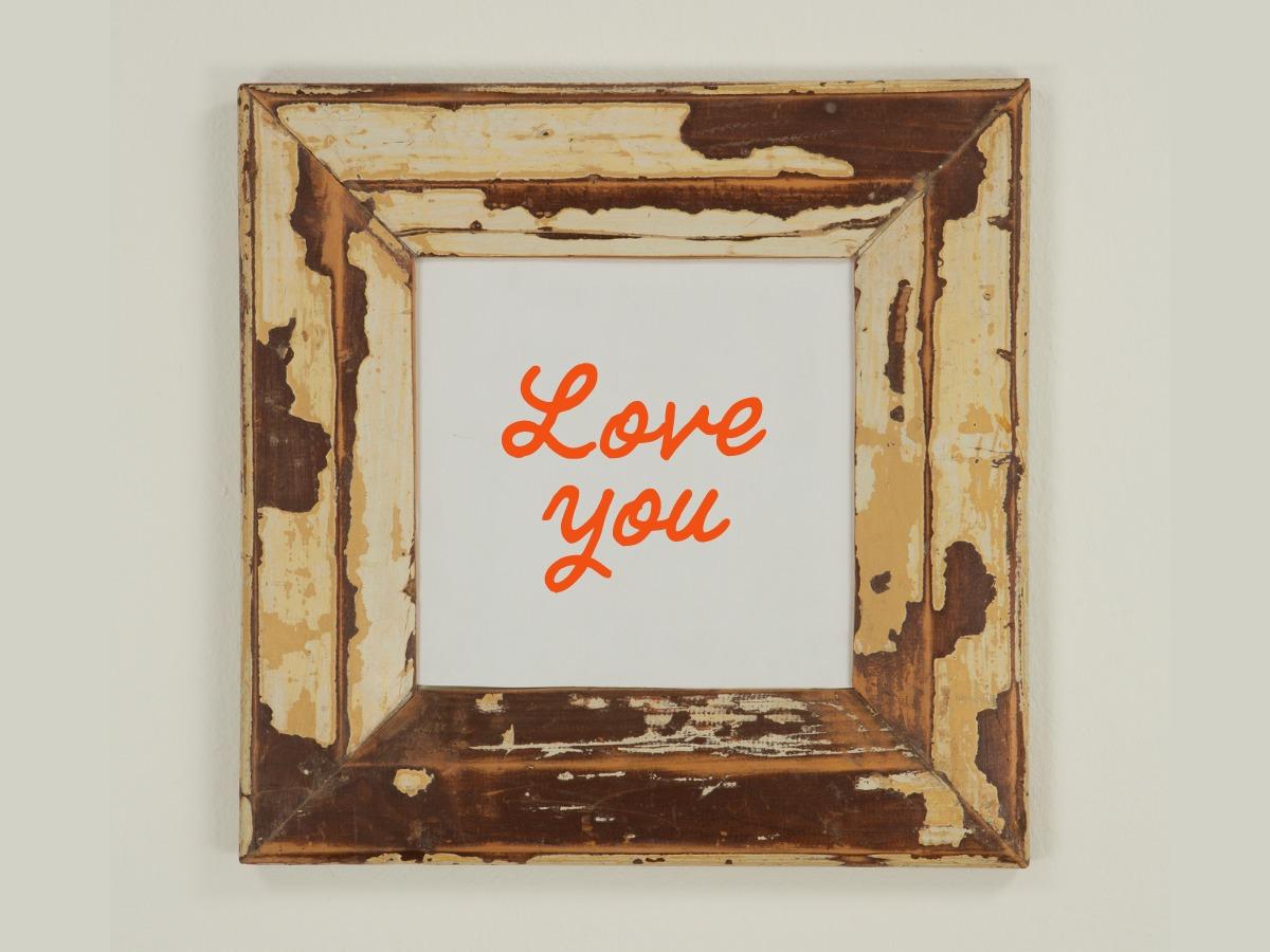
Framing helps you to organize the information in your design. A frame can be a basic or decorative border around objects to guide the eyes towards a focal point. Use frames to zoom in and crop your composition or to create a visual balance.
There are several framing techniques you can try out. For example, insert a border within a frame on your canvas to create a multi-dimensional effect and make the elements within that inner border the focus of your design. You can also experiment with text, icons, or textures as framing devices around objects.
Spruce up Your Visuals for Social Media
These techniques can guide you to create aesthetically pleasing visuals for social media that stop your audience from scrolling. More advanced designers go against the structure of a frame on purpose sometimes to make their design look “off” to grab attention. When creating graphics for social media, follow graphic design trends to keep visual content fresh for your feed.
7. Typography
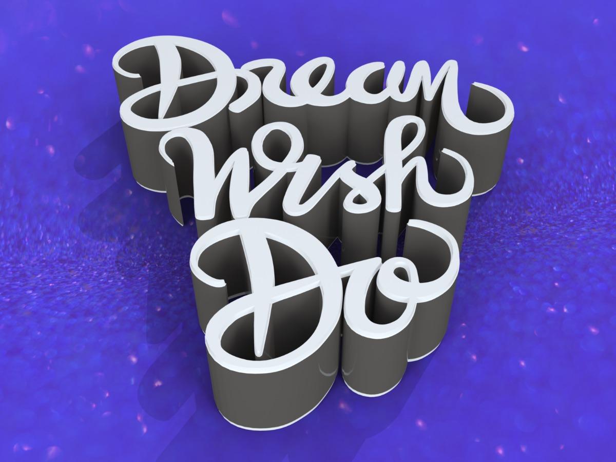
Typography includes the fonts used to arrange text in your design, the spacing of the letters, their size, and their weight. Type helps you to convey words and ideas in your design but it also goes beyond that when designers use fonts to create striking visual elements.
Use typography to create structure. To avoid complexity, a user-friendly design doesn’t use more than two different fonts at a time. When you design a logo for your business, choose a font style that tells your brand’s story. To narrow down your selection process, have a look at the three major categories of typefaces that most fonts belong to. See whether serif, sans-serif, or a decorative style fits best with your brand and do your research within one category.
Good Copy Needs Great Design
For your advertising campaigns, good copy is essential but typography is as important as color when it comes to generating certain emotions. Emphasize words by making them bold or adjusting the color to make them stand out. You can also try something new and show your skill and passion as a designer by using trending fonts.
8. Scale
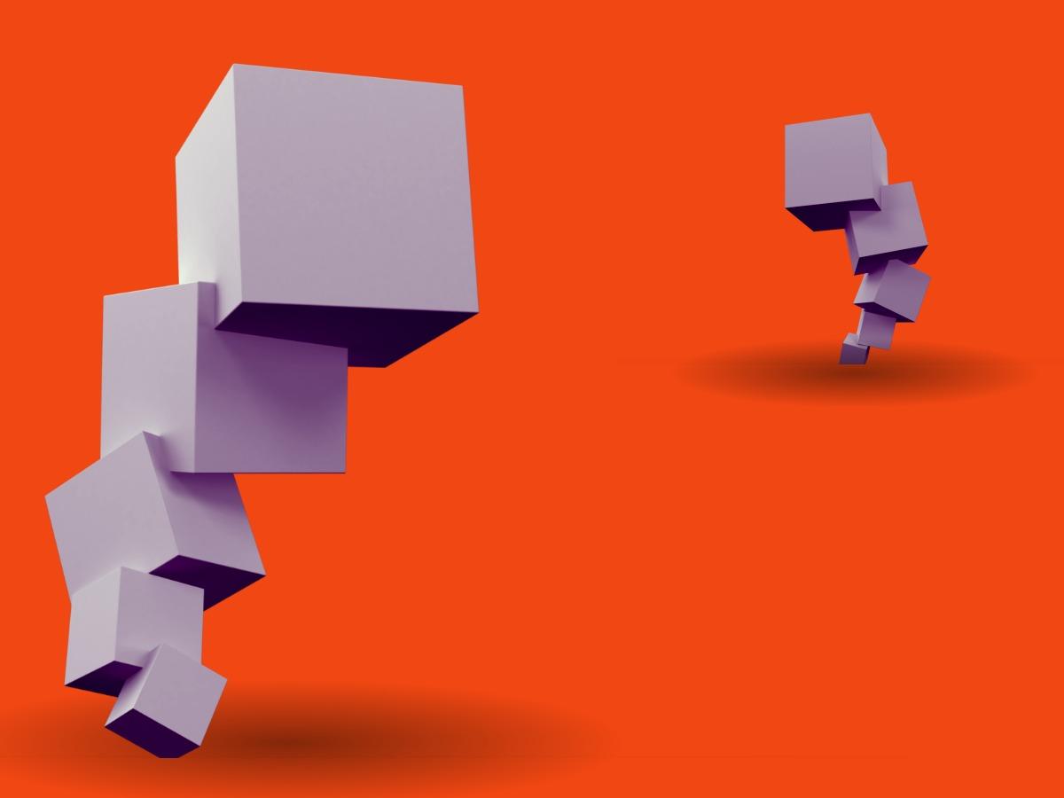
Scale refers to the relationship between two or more objects and how they are seen in comparison to each other. The focus here is on the different sizes of various elements in your design.
Scale affects your entire composition and can have a big impact on meaning and tone. Use scale to tell a story and create a hierarchy to direct the eyes and take viewers on a visual journey.
Explore Scale to Create Eye-Catching Visuals
For professional content, subtle differences in scale are often sufficient whereas creative projects give you more room to play around in. Depending on the type of project you’re working on, use scale to add interest to your design. For example, in advertising, experiment with both extremes of using an oversized or a miniature object without any other elements added to put the focus on a single product on your promo poster.
9. Hierarchy
Hierarchy creates a structure within a design. If everything stands out, nothing stands out, so you can see hierarchy as a way of prioritizing objects in your design. It’s used to show the relationship between elements and guides the eye along a specific order.
For example, when you create an object with sharp corners and a distinct color in front of a pale rounded object, you make it clear that the sharp-edged object is more important than the rounded one. When using typography in your design, you can create a hierarchy by using a larger and bolder font style for your heading than for your subheading.
Put Elements in Order for Ease
Use visual hierarchy in your marketing materials to make it easier for your target audience to scan your content and determine what’s important to them easily. Keep this in mind for your website to draw the eyes of site visitors to the most important information and calls to action.
10. Balance
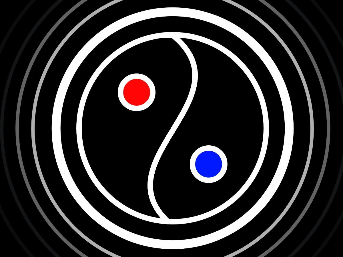
When designers talk about balance, they’re working on getting the visual harmony and order right within their designs. If creating tension is your goal, creative freedom allows you to bend the rules and craft unbalanced layouts.
Balance also includes the concepts of symmetry and asymmetry. Most designers prefer experimenting with asymmetry due to its eye-catching effect and the contrast it creates.
Experiment with Attention-Grabbing Layouts
Depending on the outcome you want to achieve with your marketing campaign, you can play around with balance and symmetry. For example, your layout may be symmetrical but can be unbalanced at the same time, or you could place elements randomly within your asymmetrical layout and still create a perfectly balanced overall design. Both combinations can be used to create an interesting design that catches attention.
11. Harmony
You know your design is complete when all the pieces work together smoothly. The combination of elements with a visually satisfying effect is called harmony. A good harmonic design is clean and undisruptive.
Combine and arrange adjacent colors, similar shapes, and related textures to achieve harmony. Be sure to select shades from your color palette that balance each other out. Consistency is also part of harmony. For example, if you’re using typography, be consistent by selecting not more than two fonts to use across one design.
Craft Relationships between Elements
When you set out to create a harmonic design for your marketing campaigns, use elements that are not completely different but stand in some kind of relationship with each other. This can be the distance between objects or proximity, how they seem repeatable with other elements or their similarity, or creating a sense that there’s a pattern or continuation.

Elisabeth Strasser
Having graduated with a Professional Writing MA with distinction, Lizzie set out to gain her copywriting and digital marketing experience in Cork City.
An Austrian with a love for Ireland, Lizzie loves exploring Irish folklore and storytelling. Her favourite DW tools are: Youtube Outro Maker and Add Logo to Video tools.
