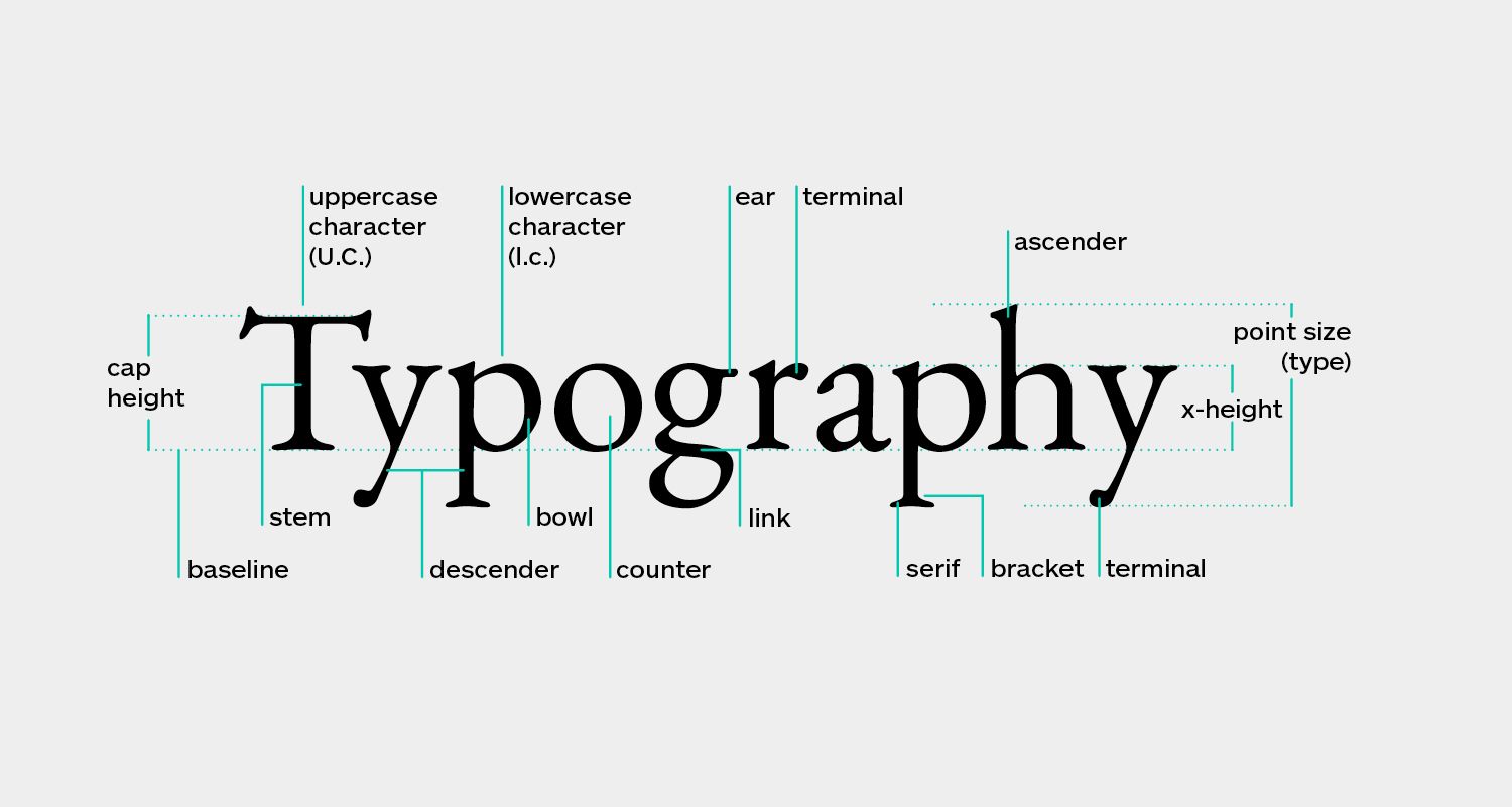
Typography can be explained as the art of placing letters and text such that the copy is readable, clear, and visually appealing to the reader. It includes font style, appearance, and structure, with the goal of eliciting specific emotions and conveying particular messages. In a nutshell, typography is what makes the text come to life.
Typography enables designers to arrange type in ways that transmit a message that goes beyond the words themselves. The typography design serves numerous functions, such as making words intelligible, generating emotion, and establishing a consistent brand identity. A brand logo with suitable typographic components can influence consumer perception of the brand, and visually appealing font pairings can make presentations more vibrant. Effective typography should hold the attention of the spectator without being distracting.
Let us learn why different typography is so important:
- Typography plays a vital role in enhancing brand recognition
- Typography can influence the decisions the viewers and consumers make towards engaging with your brand
- Readers are captivated by typography; thus, determining a specific style that resonates with your brand’s personality is key to apt representation
Classification of Different Typography
Most typefaces are divided into six categories: those with serifs, those without serifs, blockier serifs, scripts, handwritten, and decorative styles. Typographers and typography academics have established several ways to categorize different types of typography more firmly, and some of these systems contain scores of sub-categories.
A classification system can aid in the identification, selection, and combination of typefaces. While six categories are insufficient for designers, dozens become self-defeating. Let us go through the following hybrid system that introduces us to 15 different typography styles based on the historical and descriptive nomenclature first published in 1954 as the Vox system, which is still widely acknowledged as a standard today.
Here are 6 of the basic font Classifications:
Serif Type Styles
- Old Style
- Transitional
- Neoclassical & Didone
- Slab
- Clarendon
- Glyphic
Sans Serif Type Styles
- Grotesque
- Square
- Humanistic
- Geometric
Slab Serif Type Styles
- Antique model
- Italienne model
- Typewriter typefaces
- Geometric model
Clarendon model
Script Type Styles
- Formal
- Casual
- Calligraphic
- Blackletter & Lombardic
Handwritten
- Cursive
- Brush Fonts
- Chalk Fonts
- Monoline Fonts
- Calligraphy Fonts
Signature Fonts
Decorative
- Grunge
- Psychedelic
- Graffiti
Different Font Classification & Its use Cases
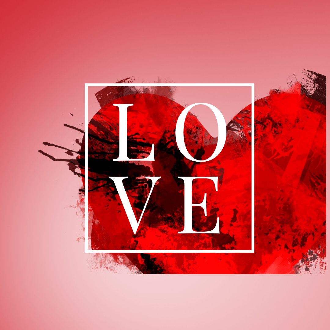
Serif fonts are Classic, Traditional, and Trustworthy
Sans-serif fonts are Modern and Clean and help create a Minimal Design
Sans-serif typefaces are considerably simpler in shape than serifs and convey a sense of purity that makes a modern, minimal design. In recent years, sans-serif fonts have taken over the web, with many of the top tech companies, like Facebook, Google, Netflix, and Spotify, opting for bold sans-serif brand fonts.
Slab serif fonts are Bold, Quirky, and Confident
A variation of the Serif font, slab serifs feature bigger, blockier serifs. As a result, they appear more rugged, bold, and quirky than standard serif fonts. This sort of font works well for firms like Volvo, Sony, and Honda, which have a lengthy and proven history of creating high-quality products but want to appear current.
Script fonts are Elegant and Unique
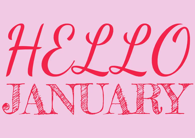
Script fonts are elegant, with character strokes connecting one letter to the following, seeming like cursive handwriting. Just like everyone’s handwriting is individual, each script font is distinct. They tend to follow current design trends, making script fonts a dangerous choice for brand typography because they may go out of style too quickly. Nonetheless, script fonts employed by companies such as Ford, Johnson & Johnson, Cadillac, and Instagram have withstood the test of time (so far).
Handwritten fonts are Informal and Artistic
Handwritten fonts are self-explanatory. They are typefaces that appear to have been written by hand. They occasionally use unusual letterforms and are as far away from typical serif fonts as you can get. They are a great choice if you want to promote yourself as a lighthearted, informal, friendly, or artistic brand.
Decorative fonts are Stylized, Distinctive, and Dramatic
The most diversified fonts are decorative fonts. They include any font that employs unusual shapes, forms, or proportions to achieve a highly stylized appearance, such as graffiti fonts. The logos of Lego, Disney, and IBM all use different decorative fonts that help to distinguish their brands. However, these powerful fonts should be used sparingly. They tend to be more trendy, which you may want to avoid if you want your brand to last for years.
While choosing a typography style, it is key to know when and how they can be used.
How to Use Serif Fonts?
Serif fonts can appear authoritative and competent and convey the weight of history or experience, reminiscent of the old manner of typewriters. “They have a more clinical and institutional vibe,” adds Todd, who utilises serif typefaces to reflect bygone times. Serif typefaces might give readers the impression that they are reading something that existed before modern design conventions.
How to Use Sans Serif Fonts?
When modernist designers adopted sans serif typefaces, they became synonymous with cutting-edge design, commerce, and modernism’s drive to break with the past. Sans serif fonts also function well when there are not many areas for copy. Sans serif fonts are commonly used for signs, text in apps, and names on maps.
How to Use Slab Serif Fonts?
The slab serif family is distinguished by thick block lines at the ends of strokes. They can be curvy or more prominent and unbracketed. Slab serif fonts are excellent for drawing attention and are best used in presentations and document headers. The strong serif font in a header draws the reader in and makes your content stand out.
How to Use Script Fonts?
How to Use Decorative Fonts
Decorative fonts work best in the most imaginative designs. They are not suitable for reading lengthier texts, so keep them to headlines and other one-off designs. Decorative fonts should be used sparingly in your designs, but they can serve a strategic function in creating interesting and engaging images.
How to use Handwritten Fonts?
Depending on how they are used, they can be highly successful in conveying both elegance and eccentricity. Chalkboards and old signage can be fantastic sources of inspiration for this style of type design. They are well-suited for banners, social media posts, print layouts, and T-shirts.
Finding the perfect font ultimately comes down to weighing whether it will be used in body text, the user experience you want, and the attitude you want to communicate. The different typography font styles have their time and place, and knowing when to choose between them is an important skill for any designer.

Rahul Shevde


